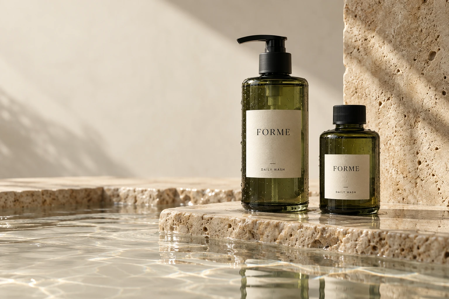
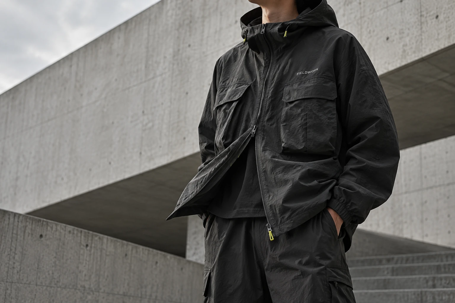
Buzzvil already knew how to reach people likely to be interested. I built the Interaction Composer to explore the next question: how could we turn that knowledge into a different brand experience for each audience?
FORMESkin, in good company.
Less.Better.
THE DAILY RITUAL
01 / Discover
Make a little room for yourself.
One everyday wash. Start with the moment you want to make your own.
Keep the good part.
Choose a bottle to begin with, or a refill for the one you already keep.
FIELDWORKEquipment for life outside.
NO SETROUTE.
COLLECTION 03
01 / Discover
Where does today take you?
The same shell, with a different way to wear it. Start with your route.
Build the layer beneath.
Keep it simple with a tee, or add an overshirt. Try both combinations.
Fictional brand discoveries. Rebuilt concepts, not original tested outputs.
The design challenge
Knowing whom to reachwas only half the problem.
From 2025, Buzzvil’s focus expanded beyond getting a campaign seen or clicked. Our targeting and retargeting, including reaching people who had already shown interest, gave us a strong starting point. The next challenge was to shape what those people experienced with the brand.
Who is this for?
Audience context
What we know about a group’s interests and behavior, informed by Buzzvil’s data and analysis.
What should it feel like?
Brand context
The brand’s identity, product information and insights, so the interaction belongs to that brand.
What should it achieve?
The advertiser’s goal
The action the campaign aims to encourage, such as a purchase. This is its key performance indicator, or KPI.
Interaction Composer
Choose and combine interactions for this audience, brand and goal.
A tailored journey for each audience group
Discover the brandExplore the productTake the next step
A possible journey, composed from audience and brand context.
Personalize the journey through the campaign.
A user segment is a group of people with shared characteristics. The design challenge was to turn what we knew about each group into a relevant sequence of interactions, while keeping the brand recognizable and the advertiser’s goal clear. One generic landing page could not express all of those differences.
My proposed approach
One library could assembledozens of interactions.
My proposal was to give the AI a library of interaction patterns it could combine using audience data, brand context and the advertiser’s goal. Alongside the product team’s research, I built the Composer and a testing tool, the UI Cooker, to assemble and compare those variations.
FORMEEveryday, considered.
Less. Better.
Your discovery reward2 / 3
A fresh start needs a new bottle.
O TrueX False
✓ Keep the bottle. Refill the ritual.
O/X quiz
A choice. Immediate feedback.
FORMEEveryday, considered.
A LITTLE SOMETHING
Good things. Just underneath.
YOUR DAILY PERKExtra care.WITH YOUR NEXT RITUAL
✳✳
Scratch & reveal
Let a gesture uncover the reward.
FIELDWORKEVERYDAY EQUIPMENT
A CHANGE OF PACE
TAKE A TURN.
Spin the wheel
Build anticipation around a reveal.
FIELDWORKEVERYDAY EQUIPMENT
MAKE IT YOUR EVERYDAY.
02 / 04
KEEP
STUDIO SHELL / 01No set route.
×
Swipe deck
Discover a preference, one card at a time.
FORMEEveryday, considered.
A LITTLE FAMILIARITY
A good match.
Find the things that belong together.
✓
f.
f.
f.
✓
f.
One pair found.
Memory match
Turn product recognition into play.
FORMEEveryday, considered.
Daily careBody care
YOUR PICK
The Daily Wash
A quiet essential. Made to begin again.
“Finally, a bottle I keep.”
Meet your everyday
Review-led product pick
Narrow the choice. Add a reason to trust.
Six examples from the wider library, reimagined with fictional brands and rewards.
Inside the recipe
id: 'CouponCard',
intent: 'reward',
flowPredecessors: ['FlipCard', 'ScratchReveal', 'SpinWheel'],
compositionRules: [{
  role: 'reward',
  constraints:
    'Use as the reward reveal after a discovery interaction. ' +
    'Always pair with a CTA so users can act on the coupon.'
}]
Original manifest excerpt. Each component carried design intent: where it belonged, how it behaved and what came next. Recipes combined these parts into flows.
Zoom in · One campaign refinement
Real campaigns revealedsmall reasons to leave.
Generating a flow was only the first test: people also had to stay with it. The Composer ran in a few campaigns, where usage data drove dozens of refinements. Here is one focused example, addressing people leaving before reaching the product.
Keep the reward within reach.
I kept the reward visible throughout the quiz, so every answer would show progress toward a clear payoff. Compare the two versions, then try the three questions.
The reward stays in sight. Every answer makes progress tangible.
FORMEYour daily ritual
Good habits. Less waste.
Your discovery reward0 / 3
Discover / 01
A fresh start needs a new bottle.
Discovery complete
A little care, on us.
Your reward is ready. Explore the Daily Wash.
Three small discoveries. One daily essential.
Reconstructed refinement from campaign feedback. Its effect on conversion remains unconfirmed.
Back to the research question
We chose richer contextover a larger UI kit.
Alongside my Composer experiments, the product team tested instructions and supporting tools for the AI, without restricting it to a library of interface components. Results were stronger and more flexible. Generating and validating an experience for each audience group on the server made the extra generation time acceptable.
Experience studio / FIELDWORKDraft · human review
02 / Compose & review
FIELDWORKCollection 03 / Everyday equipment
No destination required.
TAKE THE LONG WAY.
Everyday equipment / 01
THE STUDIO SHELL.
One layer. No set route.
FW-03
03 / Human decision
Judge the experience before anyone sees it.
04 / Server branch
Awaiting review Audience: new visitors
Concept demonstration with a fictional brand. Compare versions, then approve one to try the review flow.
The Composer favored speed.
Shared components worked well for the possibility of live generation: a new experience for each session.
The chosen flow favored quality.
Brand-research tools and design guidance gave the model more freedom. Admin-side generation gave us time to review each variation.
The campaign platform serves a validated interaction to each user segment. If a segment underperforms, we can generate and validate another version on the server. Generation time stays outside the user’s experience.
What I learned: better context,less machinery.
01 / UI library
Compose from what exists
A library has a ceiling.
Our UI kit made generation fast, but limited the quality and range of the results. Matching the model’s freedom would mean a much larger library and a growing system to maintain. The reason to build it became less convincing.
02 / Context + tools
BrandUser dataGoalPrompt
Give the model room to compose
Context mattered more.
Brand details, user data and the advertiser’s goal proved more valuable inputs than a catalog of components. A clear prompt connected them. Richer context gave the model room to produce stronger experiences, which we validated before delivery.
03 / Where we are going
BrandUser dataGoalPrompt
Keep the inputs. Reduce the layers.
The AI needs less scaffolding.
As models improve, we’re gradually removing layers that earlier models needed. What remains is the essential context: user data, the brand, the goal and a clear prompt connecting those factors to the goal.
The direction, simplified. The prompt logic remains proprietary; human validation still happens before delivery.