Making the lockscreenwork at scale.
I joined Buzzvil in 2014 and redesigned Honeyscreen, an app that lets people earn points from campaigns on their phone’s lockscreen. As it gained traction, we turned the experience into a software development kit (SDK) that other companies could add to their apps. It began my 12+ years of scaling products and navigating pivots at Buzzvil, which now generates around ₩100 billion in annual revenue.
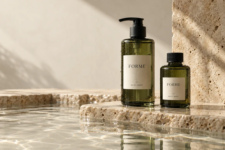
A quieter kind of care.
Meet your everyday essentials.
Reimagined lockscreens with fictional campaigns.
One app became aplatform for other apps.
Buzzvil’s own app became a platform that other companies could integrate. Advertisers fund campaigns, publisher apps earn revenue, and people earn points.
- November 2014Korean users
- 2.5MHoneyscreen era. Activity period unspecified.
- August 2018Publishing partners
- 50+Apps carrying the lockscreen platform.
- August 2018Monthly ad impressions
- 5.4BAcross Buzzvil’s lockscreen network.
Company-reported figures. Business growth reflects work across teams. Company history2018 company release
Templates freed our teamfrom adapting every campaign.
The product could reach more apps, but preparing campaign artwork still depended on two marketing designers adapting every campaign by hand. I introduced templates and guidelines that let advertisers prepare their own lockscreen creatives, so growth no longer meant repeating the same production work.
Two marketing
designers
Adapt. Export. Repeat.
A repeatable format.
- Brand
- FORME
- Headline
- A quieter kind of care.
- Description
- Meet your everyday essentials.
Supply the image and message.
The layout handles the hierarchy.
We eventually stopped
adapting campaign artwork ourselves.
The marketing design resources moved into brand and product design. This was more than a quicker production process: it changed what the team could spend its time on.
Ad networks turned thoserules into automation.
Ads arriving automatically from advertising networks could not each pass through a designer. We built reusable layouts around the image, headline and description in each native ad: the same design logic, now assembled automatically.
Let the brand change.
Keep the experience clear.
- Image
- A defined area for different creative formats.
- Message
- A readable hierarchy for copy and sponsorship.
- Interaction
- Exploring the campaign stays distinct from unlocking.
A quieter kind of care.
Meet your everyday essentials.
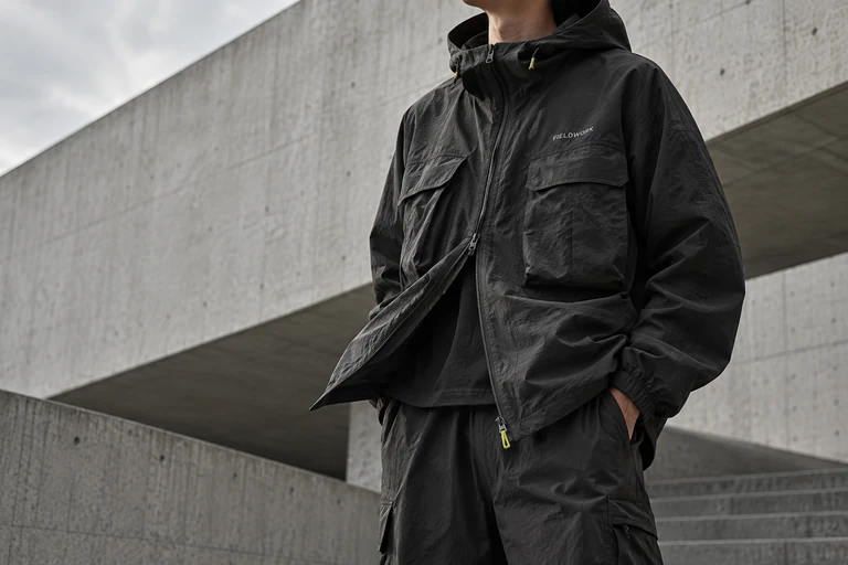
Made for the everyday outside.
Explore the new city layers.
Nearly eight years later,
the templates still run.
The team built several treatments and refined them over time. The lasting work was an adaptable system, not one campaign or one finished screen.
Two months to pivot.Without losing our customers.
In late 2017, Google’s policy disrupted our embedded lockscreen model. We had two months to change distribution. I mapped the installation and opt-in routes and coordinated the migration design so publishers could keep their lockscreen service running.
The interaction stayed. The way in had to change.
The lockscreen lived inside the partner relationship.
to change distribution
app
app
Another app to install and opt into. More friction, but a way to keep the service available.
An imperfect bridge.
An essential one.
A separate app added friction. It was not the experience we wanted long term, but it helped us keep our customers while we prepared the Offerwall. Most later made that transition with us.
What I learned.
Design what repeats.
The valuable output was not another finished creative. It was a set of rules that advertisers could use without returning to our team. Later, the ad system could use those same rules.
Consistency needs room for variation.
Images, copy, brands and point systems changed. A shared hierarchy and a predictable way to unlock gave those differences a common foundation.
Distribution is part of the experience.
The policy change made installation and opt-in as important as the lockscreen itself. Keeping an interface alive meant designing the journey that reached it.