
FORMESponsored
Find your daily ritual
Visit the brand
An Offerwall brings together campaigns and offers where people earn rewards. I connected campaign placements across our partner companies’ apps to this shared destination, first as a designer and later as product owner. Internally, we called it Feed, then Hub.
Inside a publisher app
The shared Feed
Offers selected for you Updated daily
FORMEThoughtful essentials for an everyday routine.
Fictional offer preview. No points are awarded.
 FIELDWORK
Considered layers for days in motion.
Fictional offer preview. No points are awarded.
FORMEA daily wash for a simpler routine.
Fictional offer preview. No points are awarded.
A campaign in the app. A direct route to more offers.
Reimagined product scenes with fictional campaigns and rewards.
Buzzvil’s software brought reward-based campaigns into partner apps, where publishers earned revenue and people earned points. Honeyscreen, our own app, remained a place to try new experiences.
Company-reported figures. Business growth reflects work across teams. Company history2021 company release
Hundreds of interfaces had to fit inside hundreds of different apps. I built much of the early design system around that challenge: keep a shared product, while letting each partner’s brand shape how it looks and feels.
Offers selected for you Updated daily
FORMEThoughtful essentials for an everyday routine.
Fictional offer preview. No points are awarded.
FIELDWORKConsidered layers for days in motion.
Fictional offer preview. No points are awarded.
FORMEA daily wash for a simpler routine.
Fictional offer preview. No points are awarded.
Phantom, Chameleon and the systems that followed were successive attempts at the same problem. We rebuilt and refined our UI kits through hundreds of iterations. From the start, the ambition was a headless design system: separate the product’s behavior from its visual identity, with design decisions expressed as tokens or configurable values for each brand.
A new brand should change the design values, without requiring a separate version of every screen.
Tokens are named design values. Separating the raw values from their purpose lets the same interface take on a different identity.
The raw material: colors, spacing and other foundational values.
What those values mean: a primary action, a background or readable text.
How a particular element uses those roles, allowing more precise control.
The layers, illustrated. Component-specific tokens remain a direction to develop.
The team continued this work after my early systems. Today’s SDK has a solid core-and-semantic token foundation and a full server-driven interface, configured from the server. I would like to take it further with component-specific tokens, so individual elements can adapt without changing a shared role everywhere.
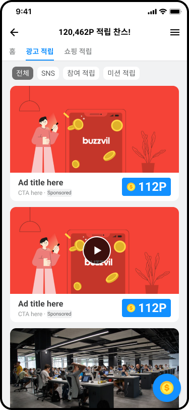
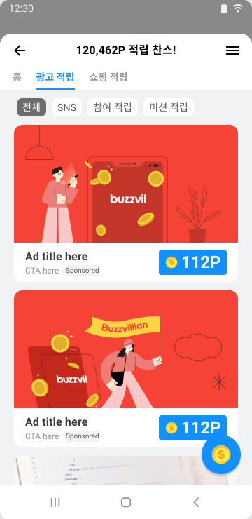
Original designs with sample campaigns and rewards.
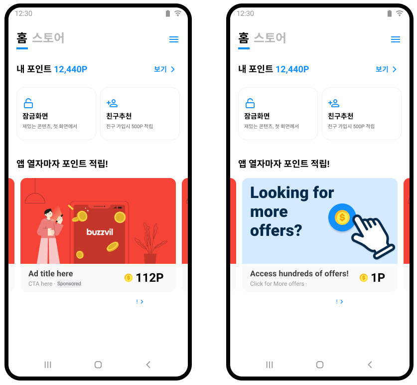
The shared Feed needed ways in from the campaigns people already encountered. One example was the carousel I created: a horizontally scrolling row of campaign cards inside a partner’s app, with a link and final card that opened the wider Feed.
One place for all your offers.
Offers selected for you Updated daily
FORMEThoughtful essentials for an everyday routine.
Fictional offer preview. No points are awarded.
FIELDWORKConsidered layers for days in motion.
Fictional offer preview. No points are awarded.
FORMEA daily wash for a simpler routine.
Fictional offer preview. No points are awarded.
Try “See all offers” in the placement.
A bundled carousel UI made customization too heavy. We moved to an integration guide and sample implementation, with SDK support for the final Feed-promotion card.
Connecting the units drove substantial Feed-impression growth. As product owner, I also needed to understand its limits: the overall product, a layout test and one carousel placement told different stories.
May–June compared with July–August 2021.
Two-month totals across all platforms.
392.0M432.2M
₩3.37B₩3.61B
Wider publisher adoption contributed to this growth. These totals describe the product; they do not isolate the effect of a redesign.
Growing exposure was not enough. Could a different layout turn more of those visits into advertiser value?
More offers were exposed.
Each visit generated more revenue.
Exposure did not translate equally into clicks.
Showing more ads increased revenue per visit, but a smaller share of those ads were clicked. A more prominent action button did not close the gap. There was no difference in people returning the next day or the following week.
Honeyscreen, Buzzvil’s rewards app · Android, 2022. Rounded changes; each chart uses its own scale. Design: Brice, Diane and Max. Analysis: Cathie. Analysis
The carousel introduced more campaigns, but did people continue to the shared destination?
12.7
Ads shown each time the placement appearedVisits from these campaign cards to the Offerwall stayed broadly flat. The carousel increased exposure within this placement; that is a different result from the growth of the connected ecosystem.
Honeyscreen Android, 2022. Before/after comparison for this placement, not the whole network. Analysis
The team continued the ecosystem after I moved on. By 2025–2026, adding more formats meant competing for the same attention: moving one section up could move another out of sight.
Requiring partner apps to have their own points system also limited who the product could serve. The next questions were about the experience itself, and what would make people participate.
Continue with Game UAShare of Hub visitors who saw each section. Later team research.
Read the team’s findingsThe Feed became more valuable when the units around it had a clear route into it. My scope grew from individual screens to the network of connected ad placements.
A shared destination did not require identical placements. Integration guidance gave publishers room to adapt the carousel while keeping its connection to the Feed.
Impressions, visits, revenue and engagement answer different questions. Their tradeoffs were more useful than a single headline number.