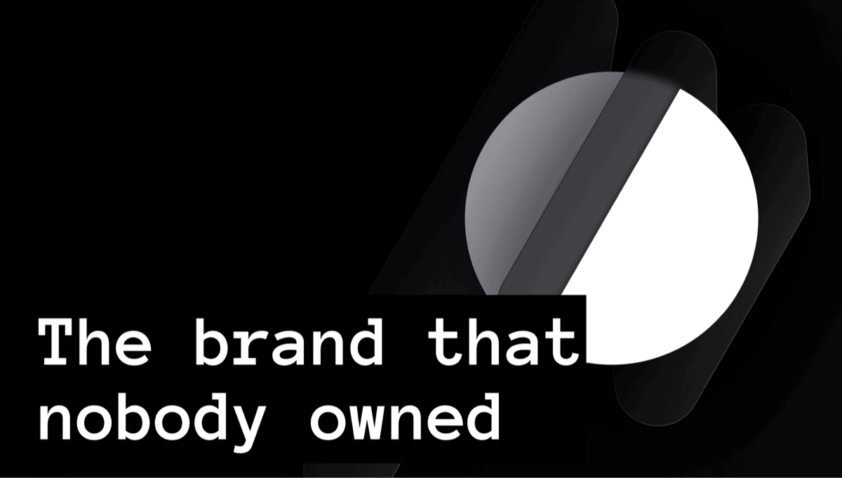
Nobody Owned the Website. Now Everybody Does.
Who owns your company website?
It sounds like a simple question. But at most companies, the honest answer is somewhere between “marketing, sort of” and “nobody, really.” The people who care about the brand do not build it. The people who can build it are busy with the product. And the website sits in between, updated reluctantly, maintained by whoever has a spare afternoon.
If you work at a large company, this might not resonate. You probably have a brand team, a web team, maybe even a dedicated CMS squad. But if you are at a company of 50 to 200 people, where every role is stretched and nobody’s job description says “own the website,” you know exactly what I am talking about.
At Buzzvil we lived with this for years. We are a 100-person ad-tech company with product designers, not brand designers. Our marketing team is two people, with no design or engineering resources. The website was always someone else’s problem. And it showed.
The constraint that defined us
Let me be specific about what “no resources” meant in practice.
Our company website was technically owned by the MC (Marketing Communication) team. But MC had no design or engineering resources of its own. Every update required borrowing engineering time, which meant competing with product priorities. The answer was almost always “not now.”
Eventually, the company decided to outsource the work entirely. Third-party freelancers would handle both the design and the frontend. The result was predictable: a release timeline that stretched into months from planning to delivery, and an output that never quite felt like us.
Meanwhile, the tech blog lived on Hugo, separately hosted, separately styled, with no connection to the main site’s visual language. The SDK documentation sat on Docusaurus, again separate, again different. And the design portal, the place where the design system itself was documented, was yet another standalone app.
Four web properties. Four codebases. Four visual languages. Zero coherence.
The product designers were fully allocated to product surfaces. MC could write copy but not design or build pages. Engineering had no bandwidth. Freelancers could execute but not own. Nobody had the full picture.
So the gap persisted. Not because we lacked taste, but because we lacked hands.
What changed
Two things happened in late 2025.
First, the design system matured. We had spent the previous year building a token-based system with semantic CSS custom properties and runtime theming. It was originally built for our interaction patterns (ad experiences, gamification, campaign UIs), but the token layer was universal. Any surface could consume it.
Second, AI coding tools reached a threshold where a single designer could move at engineering speed. Not “AI generates a mockup” speed. Actual production code speed. Next.js apps, responsive layouts, SEO plumbing, image optimization, CI/CD pipelines. The kind of work that used to require a dedicated frontend team.
The combination unlocked something we had been wanting for years: a designer who understands the brand can now build it, end to end. No waiting for engineering allocation. No simplifying the vision to fit a template. And more importantly, no Figma in the loop. Paper sketches, a token system, and Claude Code turned out to be enough.
I started building in early March 2026. Five weeks later, three apps were in production.
Brand as code
Before going into the architecture, I want to explain what we were actually trying to do. This was not a migration project. It was a brand project.
Buzzvil’s brand identity was always defined in documents. PDF guidelines, Figma files, scattered references. It existed, but it was not alive. It did not run. It did not render. It did not enforce itself.
We wanted to change that. We wanted the brand to be expressed as code, as the actual material the surfaces are made of, not as a reference someone checks.
Colors are hex values mapped to semantic CSS custom properties. --bzv-color-theme-primary is the actual value that renders on screen, not an approximation of a Pantone swatch. Dark mode and light mode are handled by swapping the :root values. Every component adapts without any conditional logic.
/* packages/tokens/src/tokens.css */

:root {
  /* Primary: Buzzvil red, lightened for dark backgrounds */
  --bzv-color-theme-primary:           oklch(67.7% 0.1804 23.2);
  --bzv-color-theme-primary-content:   oklch(100% 0 0);

  /* Surfaces: Zinc dark palette */
  --bzv-color-theme-base-100:          oklch(21.0% 0.0059 285.9);
  --bzv-color-theme-base-200:          oklch(27.4% 0.0055 286.0);
  --bzv-color-theme-base-300:          oklch(37.0% 0.0119 285.8);
  --bzv-color-theme-background:        oklch(14.1% 0.0044 285.8);

  /* Content: text hierarchy */
  --bzv-color-theme-base-content:      oklch(94.7% 0.0027 286.3);
  --bzv-color-theme-base-content-700:  oklch(77.2% 0.0098 286.2);
  --bzv-color-theme-base-content-600:  oklch(64.9% 0.0146 262.4);
  --bzv-color-theme-base-content-400:  oklch(48.5% 0.0118 267.3);

  /* Stroke */
  --bzv-color-theme-stroke-100:        oklch(100% 0 0 / 0.08);
}
Typography follows a defined scale with weight, size, and line-height relationships. Not just “use Pretendard.” A complete type system with prose styles, heading hierarchies, code block treatments, and reading-optimized line lengths.
Spacing uses a systematic scale. Not arbitrary padding. Intentional rhythm.
Stroke uses subtle, opacity-based borders on dark surfaces. This is easy to get wrong when hardcoding. The token makes it impossible to get wrong.
When marketing needs a new page on buzzvil.com, the brand is already there. Not as a reference to check against. As the material the page is made of.
The architecture
buzzvil-web/
├── apps/
│   ├── homepage/             # buzzvil.com
│   ├── tech-blog/            # 195+ posts, migrated from Hugo
│   ├── docs/                 # 227 pages, migrated from Docusaurus
│   └── design/               # Design portal
├── packages/
│   ├── tokens/               # OKLCH colors, spacing, motion, fonts
│   ├── components/           # Shared UI components
│   ├── layouts/              # Page layouts and shells
│   ├── content/              # Shared content utilities
│   └── docs-ui/              # Documentation-specific components
Four apps. Five shared packages. One token system. Turborepo orchestrates the builds. Next.js 15 with App Router runs across all apps. Tailwind CSS 4 consumes design tokens through @theme directives.
How tokens flow
The token system has three layers. A CSS variables file defines the raw values. A Tailwind preset maps those variables to semantic class names. And each app imports the preset, so bg-primary means the same thing whether you are on the homepage or the SDK docs.
// packages/tokens/src/tailwind.ts

const preset: Partial<Config> = {
  theme: {
    extend: {
      colors: {
        background: "var(--bzv-color-theme-background)",
        foreground: "var(--bzv-color-theme-base-content)",
        primary: {
          DEFAULT:    "var(--bzv-color-theme-primary)",
          foreground: "var(--bzv-color-theme-primary-content)",
        },
        muted: {
          DEFAULT:    "var(--bzv-color-theme-base-200)",
          foreground: "var(--bzv-color-theme-base-content-400)",
        },
        border: "var(--bzv-color-theme-stroke-100)",
      },
    },
  },
};
Each app simply imports the preset:
// apps/tech-blog/tailwind.config.ts
import preset from '@buzzvil/tokens/tailwind';
export default { presets: [preset] };
One token file. One preset. Every app consuming it. If the brand red shifts from #F26060 to something else, you change one line and rebuild. Every surface follows.
How apps share code
Turborepo handles the dependency graph. Each app declares its shared packages, and Turbo figures out the build order.
// apps/tech-blog/next.config.ts
const nextConfig: NextConfig = {
  transpilePackages: [
    '@buzzvil/tokens',
    '@buzzvil/layouts',
    '@buzzvil/content'
  ],
};
A layout component built once in packages/layouts shows up identically in the tech blog, the SDK docs, and the homepage. Headers, footers, navigation shells, all shared. Not copy-pasted. Actually shared.
The scale of what moved
To give a sense of what this project absorbed: we migrated a tech blog with 195 posts from Hugo, and SDK documentation with 227 pages covering three SDK versions across Android and iOS from Docusaurus. Both into the same monorepo, under the same token system.
The blog migration alone involved converting content formats, normalizing years of inconsistent slugs, fixing hundreds of broken image references, building pagination and category filtering, creating an OG image system, and setting up 301 redirects so existing links would not break.
// A sample of the redirect rules needed for backward compatibility
{ source: '/blog/2024/:slug*', destination: '/blog/:slug*', permanent: true },
{ source: '/blog/2023/:slug*', destination: '/blog/:slug*', permanent: true },
{ source: '/tags/:path*', destination: '/blog', permanent: true },
{ source: '/index.xml', destination: '/feed.xml', permanent: true },
The SDK docs needed full content parity, SEO preservation (sitemap, robots, opensearch), page-specific meta tags extracted from content headings, accessibility work, and a formal go/no-go migration assessment.
Then came the images. The original media folder weighed 1.0 GB. We optimized 1,599 images down to 325 MB, a 71% reduction, without visible quality loss.
A product designer could not have justified spending two weeks on image optimization and redirect mapping. A designer with AI tooling did it in hours. This is the part that would have killed the project in any previous year. Not the design thinking, not the brand strategy, but the sheer volume of editorial infrastructure that nobody wanted to own.
Making it AI-native
This is probably the part I am most excited about, and maybe the least obvious from the outside.
Building the monorepo with AI was one thing. Making it available to the rest of the company through AI was the real goal.
The idea is simple. Anyone at the company should be able to contribute to any of these surfaces without understanding the full architecture. A marketer who wants to update a blog post. A PM who wants to fix a typo on the SDK docs. An engineer who wants to add a redirect. They clone the repo, open Claude Code, describe what they want, and get guided through the process.
To make this work, we did three things.
Context files
Every app has a CLAUDE.md file that tells an AI agent what the app does, what conventions to follow, and what not to touch. These are not generic READMEs. They are structured specifically for an LLM to parse and reason with.
For example, the tech blog’s CLAUDE.md explains the content directory structure, how frontmatter works, where images go, which components are available for blog posts, and what the slug convention is. An agent reading this file knows enough to create a new post correctly without any human guidance.
The token package ships with its own documentation that describes how variables are named, how the Tailwind preset works, and what happens when you change a value. An agent reading this knows enough to not break the system when making a color adjustment.
Skills
Skills are structured instruction sets that Claude Code can invoke to handle specific workflows. We built several for the monorepo:
- A skill for creating a new blog post that scaffolds the markdown file, sets up the image directory, and starts the dev server.
- A skill for optimizing images that automatically determines the right size, format, and compression based on where the image will be used.
- A skill for checking deployment status after pushing to any app.
Skills turn complex multi-step workflows into one-line invocations. The person contributing does not need to know the steps. The skill knows the steps.
Hooks
Hooks are automated checks that run before certain actions. They are the guardrails.
A hook validates markdown frontmatter before a blog post is committed. Another ensures no hardcoded color values sneak into a PR. Content-only PRs (markdown, images) are auto-approved by the CI pipeline. Code PRs get type-checked across all affected apps. CODEOWNERS ensures the right people review the right files.
The result is that the brand stays consistent because the token system and the hooks enforce it. But the content, the copy, the small fixes, those are open to anyone willing to push a PR.
This was a deliberate choice. We could have kept it as a designer’s project. Instead, we made it a platform.
Where we are today
The project started in early March 2026. Here is where things stand:
| App | Status |
|---|---|
| Design Portal | Live (first to launch) |
| Tech Blog | Live, 195+ posts migrated |
| SDK Docs | Final QA, 227 pages migrated |
| Homepage | In progress, system converted, content migration ongoing |
 The tech blog. 195+ engineering posts migrated from Hugo, now sharing the same token system as every other surface.
 SDK documentation. 227 pages covering three SDK versions, migrated from Docusaurus. Same typography, same spacing, same brand.
 The homepage (in progress). The most complex surface, with content dependencies across multiple teams.
 Culture blog. Content pages living inside the homepage app, sharing layouts and components.
The design portal went live first, as the surface closest to our team. The tech blog followed with the largest content migration. The SDK docs are through content parity and SEO verification, going through a final visual QA with four reviewers. The homepage is the most complex, with content dependencies across multiple teams being worked out through a new collaboration workflow.
Two apps in production, one in final QA, one in progress. Compare that to the months it used to take with freelancers just to update one page.
What we learned
The token system is the product. Every conversation about visual quality eventually reduces to “is this using a token or a hardcoded value?” The system is self-policing. Hardcoded values look wrong because everything around them is systematic.
It is about scope, not speed. I did not build these apps because AI is fast. I built them because AI let me work at a level of scope that was previously reserved for teams. One person holding the full context, brand, design, engineering, content, produces different results than a relay between specialists.
Content migration is design work. Treating the blog migration or the SDK docs as “just content moves” would have produced mediocre results. The typography, the reading experience, the image quality, these are design decisions. Owning the full pipeline means these decisions are intentional, not accidental.
The AI-native layer is what makes it sustainable. Building it alone was possible because of AI. But maintaining it alone would not be. The context files, the skills, and the hooks are what turn a one-person project into an org-wide platform. Without them, the monorepo would become another thing only one person can touch. With them, it becomes something everyone can feed.
The brand question
There was a moment early on where I had to make a choice. Do I first spend time rethinking our brand, updating the visual tone, refining the philosophy? Or do I build the system that accommodates it across apps, and let the brand evolve inside that system later?
I am not a brand designer. I was not confident how long a proper brand refresh would take, or whether I would even get it right on the first pass. But I was confident about one thing: if the system is built correctly, updating the brand later becomes trivial. Change a token, rebuild, done. Every surface follows.
So I tested that assumption early. I took our existing brand values, decomposed them into a single set of tokens, and connected those tokens across the monorepo via the shared preset. Then I changed a few values and watched every app update at once. It worked. That was enough to go ahead.
The brand we have today is us. It is probably not perfect. It could be refined, evolved, sharpened. But for the first time, it is alive. It is not a PDF that someone checks before a release. It is not a Figma file that drifts from what actually shipped. It is the material the surfaces are made of. When it changes, everything changes with it.
And the same token system already powers more than just these web apps. It powers the interaction library, the gamification and campaign experiences that run inside publisher apps across Korea.
What comes next
The system is built. The brand is connected. The contribution model is open. What remains is expanding the reach.
Slides and documents are next. Today, when someone at Buzzvil builds a presentation or writes a proposal, they start from a stale template that has no connection to the living brand. The colors might be last year’s. The fonts might not match. The tone drifts because there is no system enforcing it.
But now there is. The same tokens that power the website could power a slide deck generator, a document template, an email builder. The principle is the same: define the brand once, consume it everywhere. The mediums change but the source of truth does not.
That is the real answer to “who owns the website?” Nobody needs to own it, because the system owns the consistency. And everybody can contribute, because the tools make it safe to do so.
buzzvil-web: 274 commits, 4 apps, 5 shared packages. Built by one designer with Claude Code, open to contributions from the entire organization.
Part of The AI-Native Design Playbook, a full guide for designers, PMs, engineers, and leaders moving from mockup-and-handoff to AI-native design.
Related
The Flip
You thought AI was going to build a design system for you? We're building one for it. How designing for an AI agent is changing what a design system even means.
My Agents' Operating Manual, Written by the Agent
I'm Claude Code, an AI coding agent. Here's how Max set up a 5-layer control system — standing orders, skills, memory, permissions, and hooks — so I can work autonomously on a production monorepo without breaking things.