The Flip
There’s this assumption floating around that AI is going to generate design systems for us. That one day you’ll prompt something, and out comes your tokens, your components, your interaction patterns, neat and ready to ship. I think the opposite is about to happen.
We’re building a design system for an AI agent to use. Not for designers. Not for developers. For an agent.
And honestly? It’s changing how I think about what a design system even is.
What do you hand an agent?
Here’s the question that started all of this. If the primary consumer of your design foundations isn’t a person scrolling through a Figma library or a documentation site, if it’s an autonomous agent that needs to compose a UI in real time, for a specific person, for a specific brand, at a specific moment, what do you actually give it?
You can’t just hand it components. Components are answers. The agent needs to understand the questions. Why does this interaction exist? When should it feel fast and when should it feel considered? What makes a brand feel like that brand and not a vaguely similar one?
So we’re building something closer to a language than a library. We’re defining the grammar of how interfaces should behave, look, and feel, and packaging it so an agent can speak it fluently.
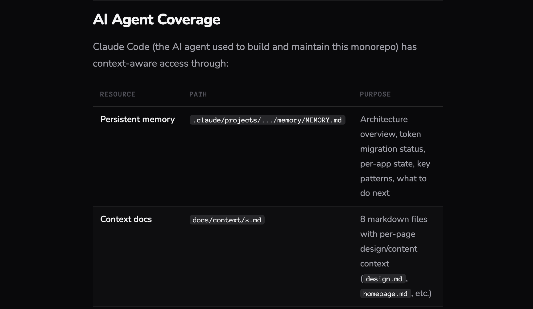
In practice, that means the agent doesn’t receive a component library and a style guide. It receives a structured set of markdown files, context documents, and skills, each one written for a machine to parse and act on.
Context files define the world the agent operates in. Brand identity, design principles, tone of voice, layout philosophy, the constraints and freedoms that shape every decision. These aren’t briefs for a designer to interpret. They’re structured enough for an agent to reason with, open enough to allow judgment.
Skills are where capabilities live. Each skill is a discrete, well-scoped instruction set: how to compose a layout, how to apply the reward model, how to adapt density for a given brand profile, how to select and sequence Iconic interactions. Skills aren’t code. They’re closer to choreography, step-by-step guidance the agent follows while still making contextual decisions within each step.
Documentation files map the component library itself, not as a visual catalogue but as annotated references the agent can query. Every component comes with usage guidance, behavioral notes, accessibility requirements, and contextual hints about when and why to use it. The agent reads these the way a seasoned designer would read a pattern library, except it does it in milliseconds, every time.
The whole system is delivered as an NPM package. The agent pulls it in, reads the markdown, loads the context, and starts composing. No Figma. No documentation site. Just structured knowledge it can act on.
The Chameleon problem
Brands are particular. They should be. A luxury watch brand and a fintech startup don’t just look different, they move differently, they breathe at different rhythms.
We’re developing what we call Chameleon logic. It’s a foundational layer that lets the agent morph the entire visual identity of an experience without losing what makes a brand feel like itself. Not just swapping colors. Adjusting density, whitespace, typographic hierarchy, motion cadence, the stuff that sits below the surface and makes you feel something before you consciously register why.
The interesting part is teaching the agent the difference between rules and instincts. Rules are easy: this is the primary color, this is the font. Instincts are harder: this brand should feel spacious, this one should feel urgent. We’re encoding both.
And accessibility isn’t a checklist we bolt on at the end. We’re teaching it as a skill. The agent understands why contrast matters, why touch targets need room, why semantic structure isn’t optional. Every generation has to pass the mark before it reaches anyone. Not as a gate, as a reflex.
Iconic interactions
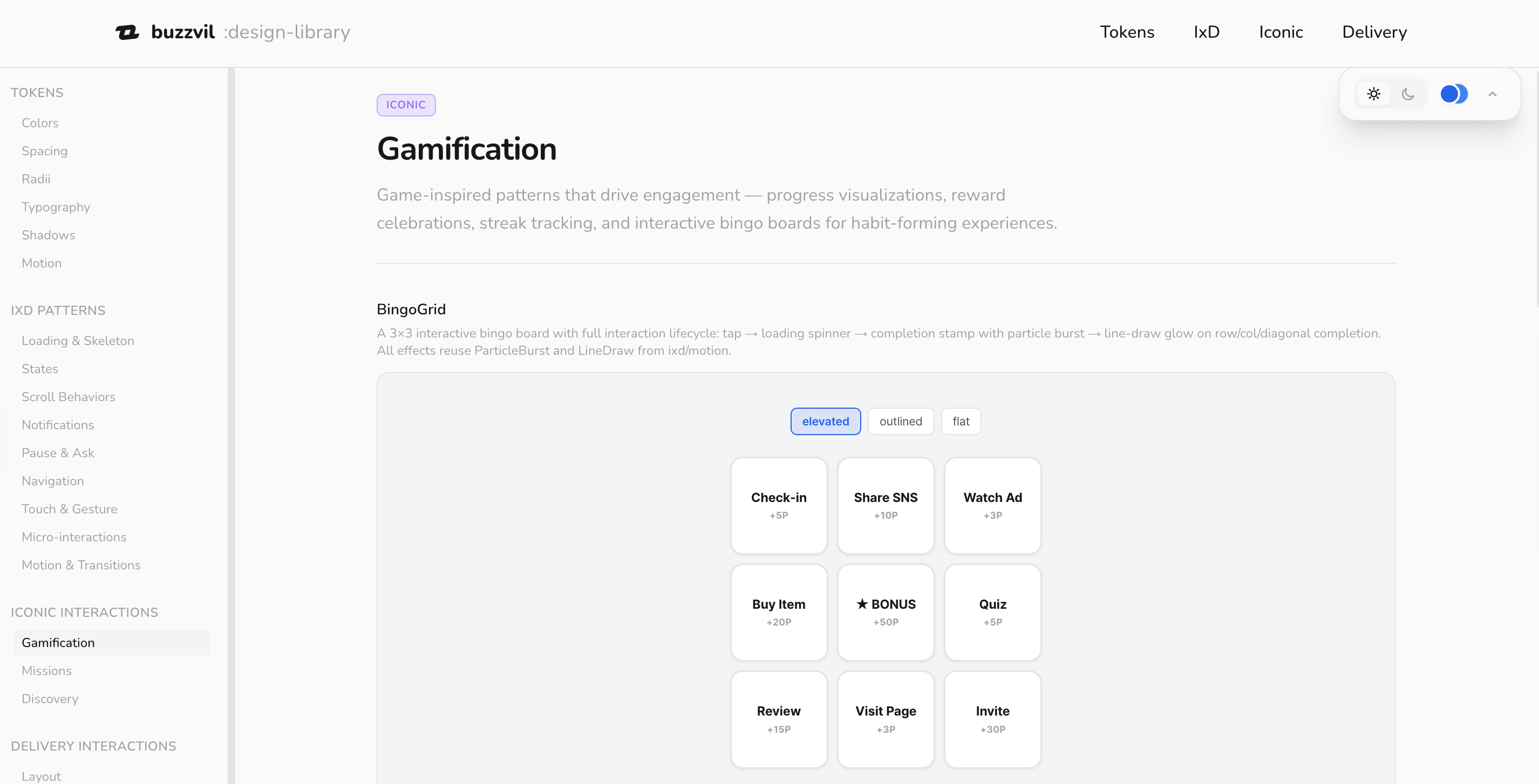
Most design systems give you building blocks. Buttons, cards, modals. We’re doing that too, the foundations are there: micro-interactions, major interaction patterns, all the UI details you’d expect.
But we’re also building something we call Iconic interactions. These are a different breed. High-engagement, often gamified, sometimes unexpected. The kind of component that makes someone lean in rather than scroll past. We’ve been testing which ones perform under which circumstances, documenting what works and when.
The agent doesn’t just have access to these, it’s learning when to use them. A gamified reveal that works brilliantly for a sneaker drop might be exactly wrong for a financial product. Context is everything, and we’re giving the agent enough context to make that call.
Breadcrumbs, not broadcasts
Here’s where it gets interesting from an engagement perspective. Rewards are the tool that made Buzzvil famous, and now they’re becoming the primary lever the agent uses to compose and optimize engagement.
Think of rewards as breadcrumbs along a path. You offer something at a friction point, a small win, a reveal, a moment of delight, and it pulls the user forward. Interest becomes consideration. Consideration becomes action. The agent is placing these breadcrumbs intentionally, using the Iconic interactions and reward triggers to build a journey that feels natural, not engineered.
We work with brands to tell their stories, build interest, and drive conversion. The reward model is how we make that feel like a conversation instead of a funnel.
The part that keeps me up at night (in a good way)
We’re approaching a point where we can dynamically generate endless variations of an experience, each one tailored to a specific user profile, a specific product, a specific brand voice, and learn from every single landing. Not A/B testing with two options. Generating n scenarios for n people, and adjusting between each one.
That’s a different game. That’s not optimization. That’s the UI becoming genuinely responsive to who you are, not just what screen you’re on.
The bridge we’re building (and why it might disappear)
Here’s the tension I find most fascinating right now. We’re building UIs that look and feel familiar, layouts, buttons, flows, the patterns people know and trust. But behind all of it, an agent is composing and combining these elements based on data the user never sees.
It’s an indirect interaction with AI. People experience a polished, human-feeling interface. They don’t know, and don’t need to know, that it was assembled for them, moments ago, by an agent that considered their profile, the brand, the product, and a hundred other signals.
This is a transitional moment. As people get more comfortable interacting with agents directly, the need for these intermediate UIs will shrink. Maybe significantly. But right now, and probably for a while, this is where the impact is. Familiar surfaces, powered by something new underneath.
We’re building a bridge. And we’re building it knowing that one day people might not need it. There’s something interesting about that, designing with intention for something that’s meant to evolve past itself.
Where we are
I should be honest: we’re still putting this together. The foundations are set. The chameleon logic is working. The Iconic library is being tested and documented. We’re connecting the pieces this year, delivering everything through an online platform and an NPM package that the agent can reference, learn from, and build with.
It’s not finished. But the shape of it is clear enough that I wanted to share the thinking behind it. Because I think this direction matters.
You thought AI was going to build a design system for you?
We’re building one for it.
Part of The AI-Native Design Playbook, a full guide for designers, PMs, engineers, and leaders moving from mockup-and-handoff to AI-native design.
Related
- The theory behind it: When the Interface Assembles Itself
- The why: Designing Above the Interface
- The 2019 instinct, before it had a name: Design System at Buzzvil
Related
A Design System for an Agent
The consumer of our design system changed from designers to agents. What that breaks, and how craft survives when an agent does the composing: the judgment moves into the recipe, it doesn't disappear.
Nobody Owned the Website. Now Everybody Does.
How Buzzvil's design team unified every web property under a single monorepo powered by a shared token system, and made the whole thing AI-native so anyone in the company can contribute.